

Cosmetics and personal care cartons
Beauty packaging has to carry colour accurately, hold crisp small text and still arrive in good shape on shelf. For cosmetics and personal care cartons, litho-laminated and folding formats give brand owners a practical way to balance appearance, protection and pack-line use.
Small details matter more on beauty packs
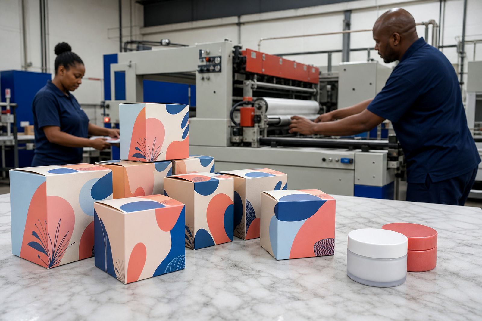
Cosmetics cartons are read at close range. Shoppers pick up a box, turn it under store lighting and look for shade names, usage notes, ingredients, batch information and barcode clarity. That means the print has to stay clean in very small areas, especially on pale backgrounds where any shift is easy to spot. A carton that looks acceptable on a larger grocery pack can feel rough on a premium skin care or fragrance line.
Fine serif text, tinted panels, metallic effects and soft neutral colours all ask more from the press sheet and the finishing line. Board choice matters too, because a smoother face stock helps hold tiny details and keeps solids more even. On cartons with multiple variants, the real work is consistency across a whole family rather than one attractive sample.
- Legibility on ingredients, directions and caution panels
- Controlled colour for nude, pastel and deep black ranges
- Accurate registration on foil, embossing and spot coatings
- Clean creases and glued seams for retail presentation
Colour control for shades, ranges and repeat orders
Many personal care lines are sold by colour family. Lip products, foundations, hair colour packs and bath ranges often use one structure with several variants, each needing its own visual identity without drifting away from the master range. On press, this calls for disciplined proofing and careful checks against approved references before full production starts.
In our Pinetown workflow, colour is not treated as an afterthought. Artwork is checked for build, overprint settings and fine reverse text before plates are made. Proofs are used to pick up likely trouble areas such as weak contrast on pale pink, low visibility on silver-grey and dense backgrounds where tiny white copy can fill in a bit. Under KwaZulu-Natal humidity, board and printed sheets also need sensible handling between print, laminating and finishing so the carton still folds cleanly later.
For a personal care range with several fragrances and matching body products, it is common to hold one brand block steady and swap only selected panels. That sounds straightforward but it takes care to keep the logo tone, skin colours and decorative tints aligned from one SKU to the next.
Finishes that add polish without making the carton fussy
Beauty packaging often needs more than flat print, but the finish should support the pack rather than fight with it. A soft contrast between matt varnish and a gloss highlight can give a carton presence without covering every panel in effect. Foil blocking can work well on a fragrance or gift line, while embossing can bring a crest, monogram or product name forward in a more tactile way.
The best finish plan usually starts with the retail environment. Packs in bright pharmacy aisles behave differently from cartons sold in boutique stores with softer lighting. If glare is likely to hide copy, a full high gloss coat may not be the right answer. If the product sits inside a humid bathroom after purchase, surface scuff resistance also deserves attention.
- Matt and gloss contrasts for selected panels
- Spot UV where you want a highlight, not a full wet look
- Foil details for premium lines and gift packs
- Embossed features where touch is part of the sale
- Protective varnish to help cartons travel and merchandise well
Board, structure and shelf behaviour
A cosmetics carton is not judged only when it comes off press. It must run through filling, close properly, stack in outers, travel to distribution points and still present neatly at retail. Folding cartons are often used for tubes, jars, pumps, soaps and smaller accessory items. Litho-laminated structures can be a good fit where more rigidity or display value is needed, especially for presentation packs and shelf ready retail units.
Structural choices should match both the product weight and the opening style expected in store. If a tuck carton is too light for a glass bottle it can distort at the side walls. If the board is too heavy for a small sachet pack, creasing and closure performance may suffer. We look at panel size, depth, seam position and the likely wear points before production moves ahead, becuase those practical details often decide whether the finished carton feels premium or merely decorative.
For humid coastal storage, it also helps to avoid unnecessary structural complexity. A clean shape with sensible locking points generally travels better from Durban into inland distribution than a carton that depends on very tight tolerances at several folds.
A workshop example from a KwaZulu-Natal beauty run
One recent workshop pattern involved a personal care range packed for pharmacy and boutique channels. The range included several fragrances, a hand cream, a body lotion and a boxed gift set. The artwork carried fine ingredient text, metallic accents and a soft cream base that had to stay warm rather than drift yellow under store lighting.
The first review flagged three issues. A pale script over a tinted panel needed more contrast, one barcode sat too close to a crease line, and a foil area crossed a fold where cracking could show. After the proof stage, the carton layout was adjusted, the foil panel was reduced and the copy was strengthened slightly. On press, the solids were watched closely so the cream tone remained even across all variants.
The final packs moved through laminating, die cutting and gluing without trouble. What mattered most was not a dramatic special effect, it was the way every SKU looked related on shelf while still being easy to identify by variant. That sort of control is where beauty packaging earns its keep.
Preparing artwork for personal care cartons
Good artwork handover saves time on a cosmetics job. Packaging in this category often carries legal copy, multilingual text, shade identifiers and careful spacing around logos and decorative elements. Files should be supplied with clear layers, embedded or outlined fonts where needed, and enough bleed for trimming. Very small reverse text needs special care, especially when it sits on dark colours or metallic backgrounds.
Before a job goes live, it helps if the brand owner or manufacturer confirms which details must stay identical across the whole range and which panels change by variant. That reduces confusion on multi-SKU runs and makes the proofing stage more useful.
- Keep ingredient and caution text readable at final size
- Flag any colour that is critical to shade recognition
- Separate variable data from fixed brand elements
- Avoid placing barcodes over folds, seams or heavy texture
- Check that decorative effects do not interfere with mandatory copy
If you need guidance on structure or finish options for a beauty line, use our contact form and we can look at the carton brief in practical terms.
What our Packaging customers say
Verified Google reviews
Questions we get asked
Can you print cartons for skin care, hair care and fragrance ranges?
Yes. We print folding cartons, litho-laminated boxes and display formats for a wide spread of cosmetics and personal care products, including multi-variant ranges.
Do you help with proofs before full production?
Yes. Artwork checks and proofs form part of the process so colour, small text, finish placement and structural details can be reviewed before the main run.
Do you make plastic packaging or brand designs?
No. Our scope is printed carton and box packaging. We do not create brand identities and we do not manufacture plastic packaging.
Also worth a look
Tell us about the job
Send sizes, materials and where you are through our contact form, and we will come back with the practical options.
Open the contact form