
Artwork guidelines
Good carton printing starts long before sheets go on press. This guide sets out the file rules we use for litho-laminated cartons, folding cartons and display packs so artwork moves into proofing and production with fewer avoidable changes.
Start with the correct dieline
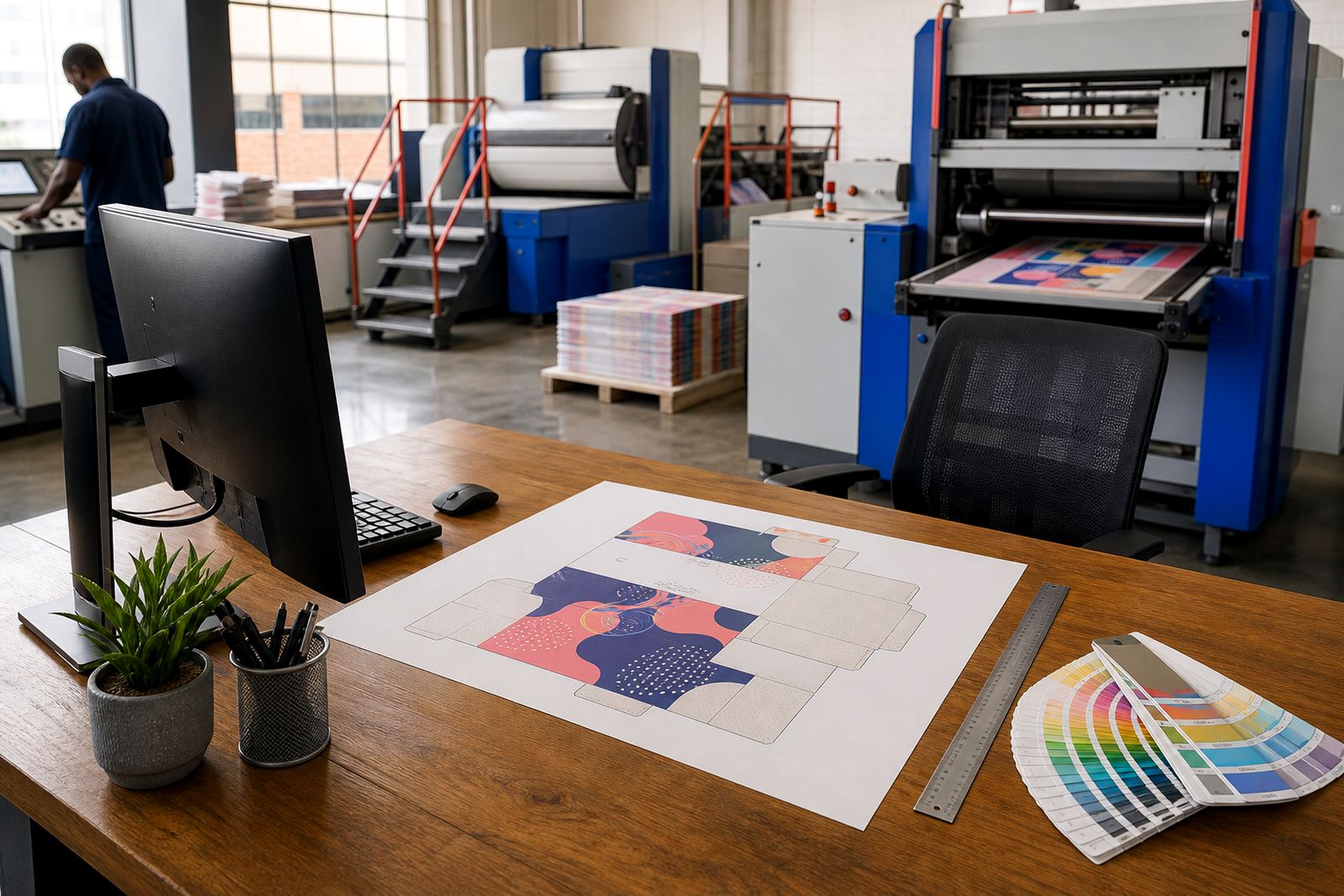
Every carton layout must be built on the approved dieline for that pack style, board choice and finished size. The dieline shows cut lines, crease lines, glue areas, panel widths, flaps and any lock tabs or windows, so it is the document that keeps structural accuracy tied to the printed design.
Please do not redraw a carton from an old sample or from a visual mock-up. Small panel shifts can affect folds, barcode position and how copy lands near creases. If a pack is changing from a folding carton to a litho-laminated box, or from one flute to another, the artwork usually needs adjusting even when the outer size looks similar.
- Place artwork on the latest approved dieline only.
- Keep cut, crease and glue guides on a separate non-printing layer.
- Do not move structural lines, flap depths or glue tabs.
- Mark front, back, side and base panels clearly in the file.
- Flag any reverse-print or inside-print panels before proofing.
Bleed, safe areas and panel edges
Printed colour, images and background tints should extend past the cut line to allow for trimming variation. For most carton work we need bleed carried beyond every outer edge, with text and critical logos pulled safely inward from cuts, folds and perforations. This matters even more on packs with dark solids or frames, where a hairline shift can show quickly on shelf.
Do not sit fine copy across a crease, and do not place legal text too close to lock tabs or tuck flaps. On shelf ready boxes and display units, remember that tear-open sections and folded fronts can hide or break a message if the layout is too tight. A neat file on screen can still be risky once it is creased and glued, that catches teams out often.
- Extend backgrounds and images beyond the cut line on all open edges.
- Keep body copy, symbols and key logos inside a safe area from trims and folds.
- Avoid border rules close to carton edges.
- Keep registration-sensitive elements away from perforations and tear strips.
- Check that base flaps and dust flaps do not interrupt mandatory text.
Colour setup for litho carton printing
Files should be prepared in print-ready colour values, not screen colour settings. If your brand uses process colour only, build artwork in CMYK. If special spot colours are required for logos, packs that must match an established shelf look, or finishes such as foil reference areas, those colours need to be named consistently throughout the file.
Very small text made from multiple process plates can print less cleanly than a single dark plate, especially on reverse-out copy. Fine rules, ingredient panels and technical information should be checked for legibility at actual size. Rich dark builds should also be reviewed carefully so they do not create unnecessary variation between panels or on heavy coverage areas.
- Use CMYK for standard process artwork.
- Name spot colours consistently and remove duplicates.
- Convert unintended RGB images before supplying final files.
- Keep small black text on a single plate where possible.
- Highlight any critical brand colour that needs closer matching on proof.
Barcodes, batch spaces and mandatory information
Barcodes need clear placement and enough quiet space around them to scan reliably after printing, laminating and packing. Put them on a flat panel where possible, not across a fold, near a glue seam, or on a heavily textured design area. Very small reductions can cause problems, especially if dark backgrounds or metallic effects sit too close to the code.
If your carton needs a batch code, expiry date, packing date or variable information added later, leave a clean printable area for that process. The space must suit the coding method used on the packing line and should not compete with varnish, foil or embossing. Regulatory copy, ingredients, warnings, importer details and recycling marks should also be checked as live text before release.
- Keep barcode quiet zones free of graphics and text.
- Do not place barcodes over folds, scores or glued joins.
- Leave open space for overprinting of batch or date information.
- Check legal copy at final pack size, not enlarged on screen.
- Make sure symbols and recycling marks are sharp and readable.
Images, fonts and file packaging
Press-ready carton files should be supplied as high-resolution PDFs built from properly linked artwork. Embedded low-resolution images taken from office documents, messaging apps or web downloads often look acceptable on screen but fall short once printed at pack size. Product shots, gradients and soft shadow effects need enough image quality to hold detail without breaking up in print.
All fonts should be embedded or converted correctly so line breaks, disclaimers and multi-language panels do not reflow. Remove hidden layers, unused colours and duplicate placed images before export. If several SKUs share one structure, label each file clearly to avoid panel swaps between flavour, shade or model variants.
- Supply high-resolution print PDFs.
- Embed or outline fonts to prevent text substitution.
- Keep linked images sharp at final output size.
- Remove unused layers, swatches and stray marks.
- Name files so version, SKU and pack orientation are obvious.
Proofing checks before release
Before a job moves to final production, review the proof at actual size and against the dieline. This is the stage to confirm panel order, barcode direction, spelling, flavour or variant references, finish callouts and the position of special effects such as spot gloss or foil. It is also the right moment to compare repeated copy across related packs so nothing drifts between variants.
Where a carton carries several languages, ingredients or technical specifications, assign one internal reviewer for each responsibility area rather than relying on a general sign-off. That tends to catch unit errors, missing symbols and panel mismatches earlier. If anything is still uncertain, send notes and marked-up pages through our contact form before approval.
For projects that need material samples or printed proofs, the route is covered in our Samples and proofs page, while board choice is explained in Choosing board and flute. Those pages work well alongside this guide when a pack has to balance presentation, protection and line efficiency.
What our Packaging customers say
Verified Google reviews
Questions we get asked
Can I send artwork made for a label or pouch and have it adapted to a carton?
You can send it as reference, but carton artwork must still be rebuilt onto the correct dieline. Panel breaks, folds, glue areas and safe zones are different, so a direct carry-over usually needs adjustment.
Should barcodes be supplied as images or vector artwork?
Vector artwork is preferred because it stays sharp and scales more reliably. The code should be placed on a plain area with proper quiet space and kept away from folds, seams and heavy finishes.
Do you check artwork before print approval?
We check supplied files for production suitability, including dieline use, panel setup and common technical issues. Brand creation and packaging design are outside our scope, so final content approval remains with your team.
Tell us about the job
Send sizes, materials and where you are through our contact form, and we will come back with the practical options.
Open the contact form